

SUBTITLE
Designing a brand for a company is one of the most rewarding things you get to do, and if you get it right you only get to do it once in the company's lifetime. I love branding. Before Crash Override, SourceClear was the best brand I have been involved in creating. That work was done in partnership with Meta Design in San Francisco, led by Brady Boyle, a creative genius who went on to be the creative director at Open Raven. The SourceClear brand can still be found proudly displayed at the Meta Design client portfolio. I loved the SourceClear brand and still do.A company brand is more than a logo, it is everything that represents the company. It is the online and the in-person, the written and the spoken, phone calls, zoom meetings, email, tweets, blogs, swag and videos. Ultimately a brand is the emotion people feel when they interact with anything or any person at the company and that includes your reputation. Our brand authentically represents our company and I am proud of it. Quite a few people ask about it and so I wanted to share the brand story and elements of the visual brand.
The Company Name
When we were starting out, John and I toyed with many names for the company but nothing stood out. Naming is hard, really hard. Almost all good domains are taken. We registered a few but never became emotionally attached to any. One day John messaged me and said “Hey I can buy crashoverride.com for a few thousand bucks. I am doing it, even if we don't use it for the company I will use it for my personal stuff. I love that movie.” I have to confess the first thing I did was Google Crash Override. Three things came up. The main character in the Hackers movie, the malware used to attack the Ukrainian power grid and the now defunct project called the Crash Override network, helping victims of online abuse. That night I watched the movie and the lightbulb went off. It is 90’s cheese but it is good cheese with Angelina Jolie and Jonny Lee Miller, and with a soundtrack by The Prodigy, Carl Cox and the Chemical Brothers, bands and DJ’s that I grew up with and love to this day. The film is about a group of American high school hackers and their involvement in a corporate extortion conspiracy. It was made when the Internet wasn't a thing and reflects the ideals laid out in the Hacker Manifesto. "This is our world now... the world of the electron and the switch [...] We exist without skin color, without nationality, without religious bias... and you call us criminals. [...] Yes, I am a criminal. My crime is that of curiosity." Eureka, that is us and everyone we are going to work with. Inclusive, curious, passionate about computer security and happy to break the mould. We are Crash Override. End of story. I now live back in Brighton on the South Coast of England, well known as a progressive city with a massive art and dance music scene. We decided to use a local branding agency that I had been impressed with called Built by Buffalo, who have turned out to be absolutely fantastic partners. When creating a visual brand the first thing you do is share a brief. Over a few hours with their creative team, we explained we wanted the visual brand to be a nod to the Hackers movie. Everyone says they are unique, but the security industry is full of hundreds of companies that all look the same and we don't care about convention. We expect to look different and are comfortable in our own skin. We wanted to be seen like Virgin, edgy but not scary, innovative and don't take themselves too seriously, like Richard Branson.
Our Color Palette and Font
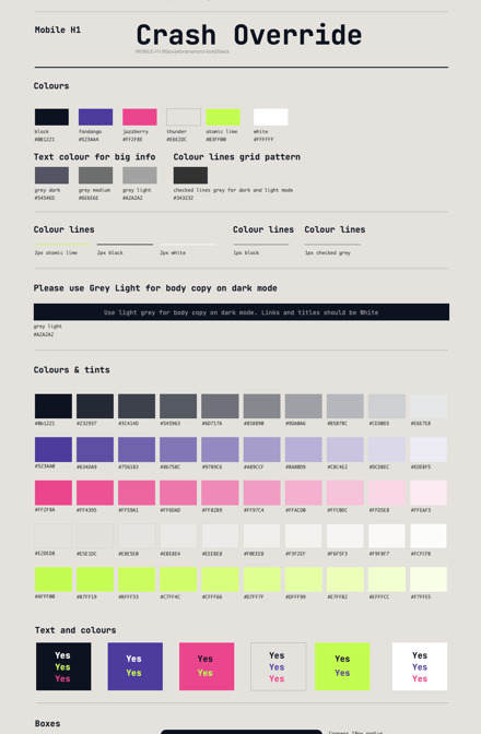
The base of a brand are the colors. Our color palette is representative of the 90’s with neon green, pinks and purples. We have a light mode and dark mode, familiar to developers and will be adding a color switcher to our website next. The font we chose is JetBrains Mono which has a SIL Open font license, available at https://www.jetbrains.com/lp/mono/. It's a developer font and you are reading with it now.
Hobo Symbols
Built By Buffalo came up with a great idea to incorporate WarChalking into the brand. From the Wikipedia article,
Warchalking is the drawing of symbols in public places to advertise an open Wi-Fi network. Inspired by hobo symbols, the warchalking marks were conceived by a group of friends in June 2002 and publicised by Matt Jones who designed the set of icons and produced a downloadable document containing them.[1][2]
As we looked into WarChalking we found that WarChalking was based on Hobo Symbols. From the Wikipedia article,
Almost from the beginning of the existence of hoboes, as early as the 1870s,[18] it was reported that hoboes communicated with each other by way of a system of cryptic "hobo signs", which would be chalked in prominent or relevant places to clandestinely alert future hoboes about important local information.
What we love about WarChalking is the simplicity yet effectiveness in helping out other people in your community. What we love about Hobo symbols is that they were used by migrants who wanted to work and to help out people in their community, sharing where kind people were and where danger was.
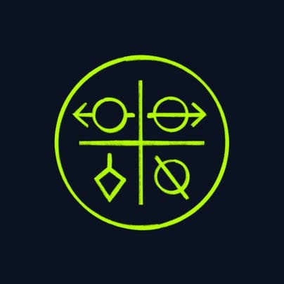
We have created a complete set of our own Hobo symbols and published them all here. We want people to use them. We have also embraced the concept of a quadrant of symbols as used in Ozark. We will be using this to tell stories about blog posts and slides. One of the things about great logos is that anyone should be able to draw them. In the coming months I am going to be sending boxes of chalk to anyone that wants to chalk up our logo and hobo symbols and send us a photo that I will post in a gallery online.
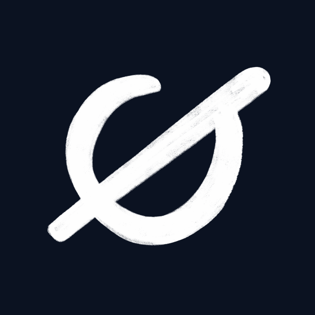
Our Logo and Logo Mark
Our logo uses the warchalking style with a reverse R as a node to leet speak. We use it in any brand color but mainly black and white.
Our logo mark is a null symbol, again drawn in the warchalking style.
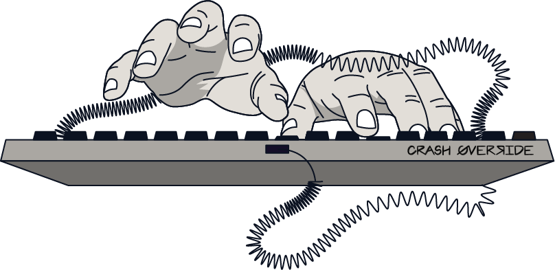
Illustrations and Art
Using a brand style we have developed we have created several images. One great example is the keyboard that I am having printed on t-shirts.
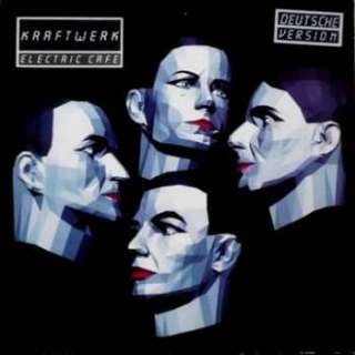
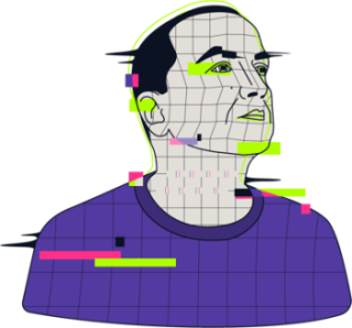
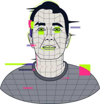
Avatars
John and I have avatars on the about us page and all members of the team will get theirs. The avatars are based on the Kraftwerk album Electric Kafe.
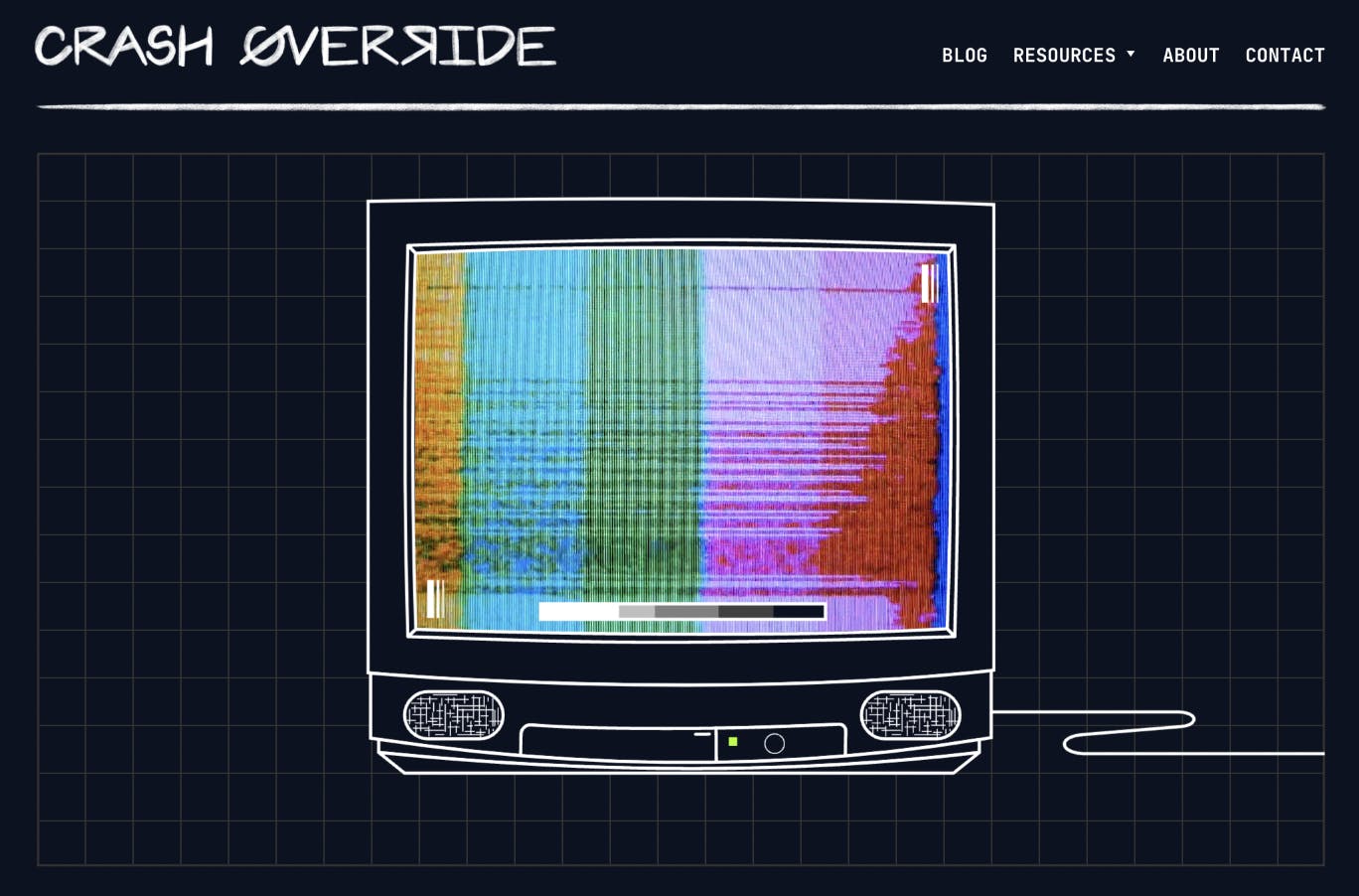
Hack the Planet and The TV
We have started a series of weekly videos and initially Zoom video discussions with fascinating people. It's called Hack the Planet. Hack the Planet was a video segment in the Hackers movie and can be watched on YouTube here. Throughout the brand on the videos and the website you will see a TV with static, also from the segment in the movie.
The Website
All of this comes together on our website and we are very proud of it.
You are on it now but click around. We have a neat 404, and a special message when you sign up for the newsletter at the foot of this page. Here are other things as well but you will need to be curious. We hope you appreciate the meaning behind our brand and the thought that has gone into it. It's the same thought and attention to detail we are putting into our product.

Share